Our periodic table visualisation
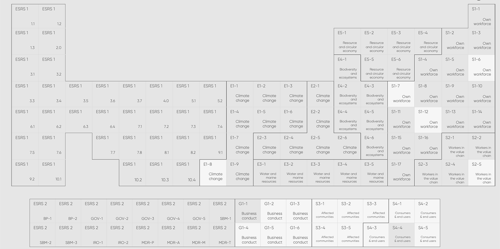
In an innovative twist to reporting, our team recently transformed the complex landscape of the European Sustainability Reporting Standards (ESRS) into a visually striking periodic table format. This not only catered to the aesthetic appeal but also brought a unique perspective to viewing these standards.
At the core of this project was the challenge of categorising and encapsulating around 157 ESRS disclosure requirements. We managed to align these elements, revealing many similarities and connections among the standards in a way that a simple list or spreadsheet just made... well.. rather boring.
The result? A cool, eye-catching periodic table that serves as a conversation piece and an artistic interpretation of otherwise-technical-and-possibly-boring-regulatory data. It has turned the dry, often overwhelming details of sustainability reporting into a visually engaging and digestible format
Is it useful?
While our periodic table of ESRS may capture the eye, it doesn’t necessarily enhance the usability of the ESRS, at least not in it's current format. The visualisation is more of an artistic take on data representation, aimed at sparking interest and perhaps offering a fresh way to engage with the standards, rather than a practical tool for compliance.
We believe that this project, while primarily aesthetic, can serve as a stepping stone for more functional and user-friendly visual data visualisation - maybe in the future we will make this...
However, for now - It’s a testament to how creative thinking can be applied even in areas as structured as sustainability reporting standards!
Let us know what you think

5 tips for a great CEO statement
Every report needs to have a good CEO statement. But what is a great CEO statement?
We've spent years looking at CEO statements and we see the same mistakes over and over again. So how can you make sure your CEO statement has everything it needs? Listen to this podcast where we talk you through our 5 tips for a great CEO statement.

Sign up to our newsletter
and we'll report back to you with industry news and updates you'll actually want to know.