Beyond the PDF: Best practices for interactive annual & sustainability reports
Audiences only read around 28% of content on a page. Yet months of effort still go into compiling dense reports that disappear into PDFs. Interactive reports are changing that.
Traditional PDF reports are made for compliance rather than communication. It’s unlikely that customers, potential investors or employees engage with the little narrative they provide. Online reports have emerged as a solution. While many companies still publish standard PDF versions, we’re seeing more interactive web reports that spotlight corporate storytelling.
Online formats encourage readers to engage with the reports by making the content easier to follow and more accessible to a wider audience. They include elements such as:
- Navigation menus for better flow
- Clickable buttons and ‘read more’ options
- Embedded videos instead of text-heavy sections
- Data visualisations to simplify lengthy tables
Despite this shift, there is little guidance on what makes an online report truly effective; which design choices, storytelling approaches and interactive features help readers understand the content? And where are the gaps?
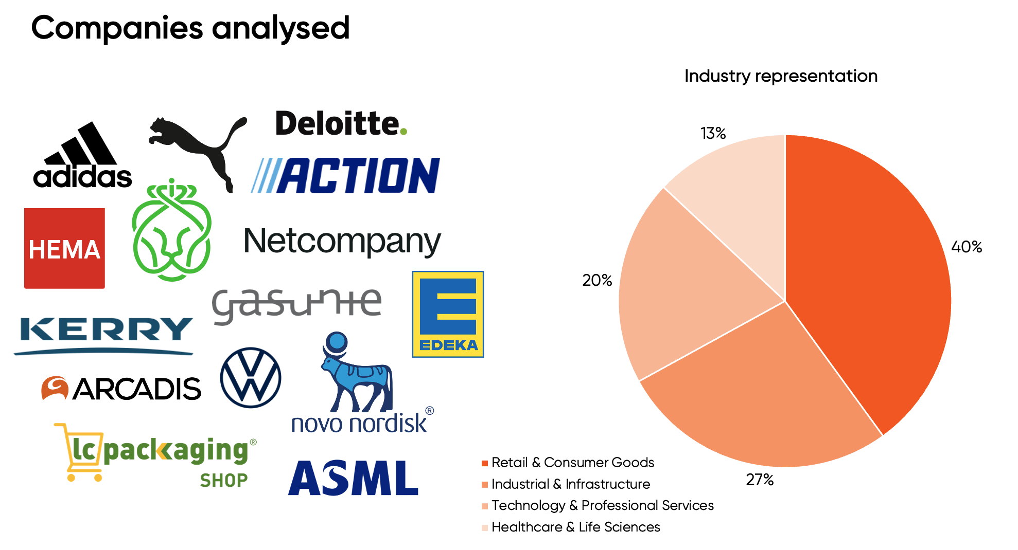
We examined 15 interactive annual and sustainability reports published in 2025 to evaluate best practices in the digital space.
Reports came from a range of industries — fashion, technology, automotive, pharmaceuticals, retail and energy — to get insights into how different businesses approach reporting from a design and interactivity perspective, regardless of their branding style.
What makes an interactive report engaging?
The evaluation was based on a set of criteria covering features commonly found in interactive reports. This includes:

Best practices
1. Clear text, structure and navigation
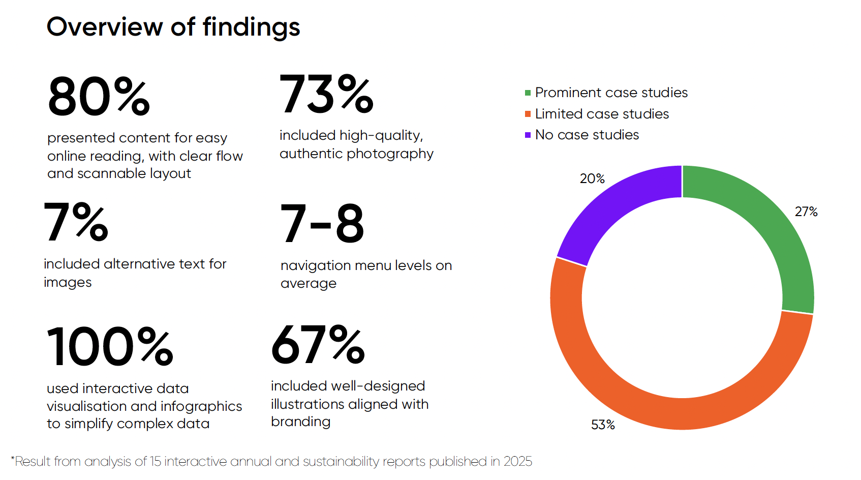
Interactive reports tend to avoid heavy text and industry jargon. About 80% of the reports were adapted for online reading, with short paragraphs and scannable summaries. Home pages generally contained concise blocks of text, while internal pages included longer explanations.
Reports also included clear navigation menus that improved flow and made it easy to move between sections. On average, reports had seven to eight menu levels, though one outlier reached 13, making it more complex to navigate.
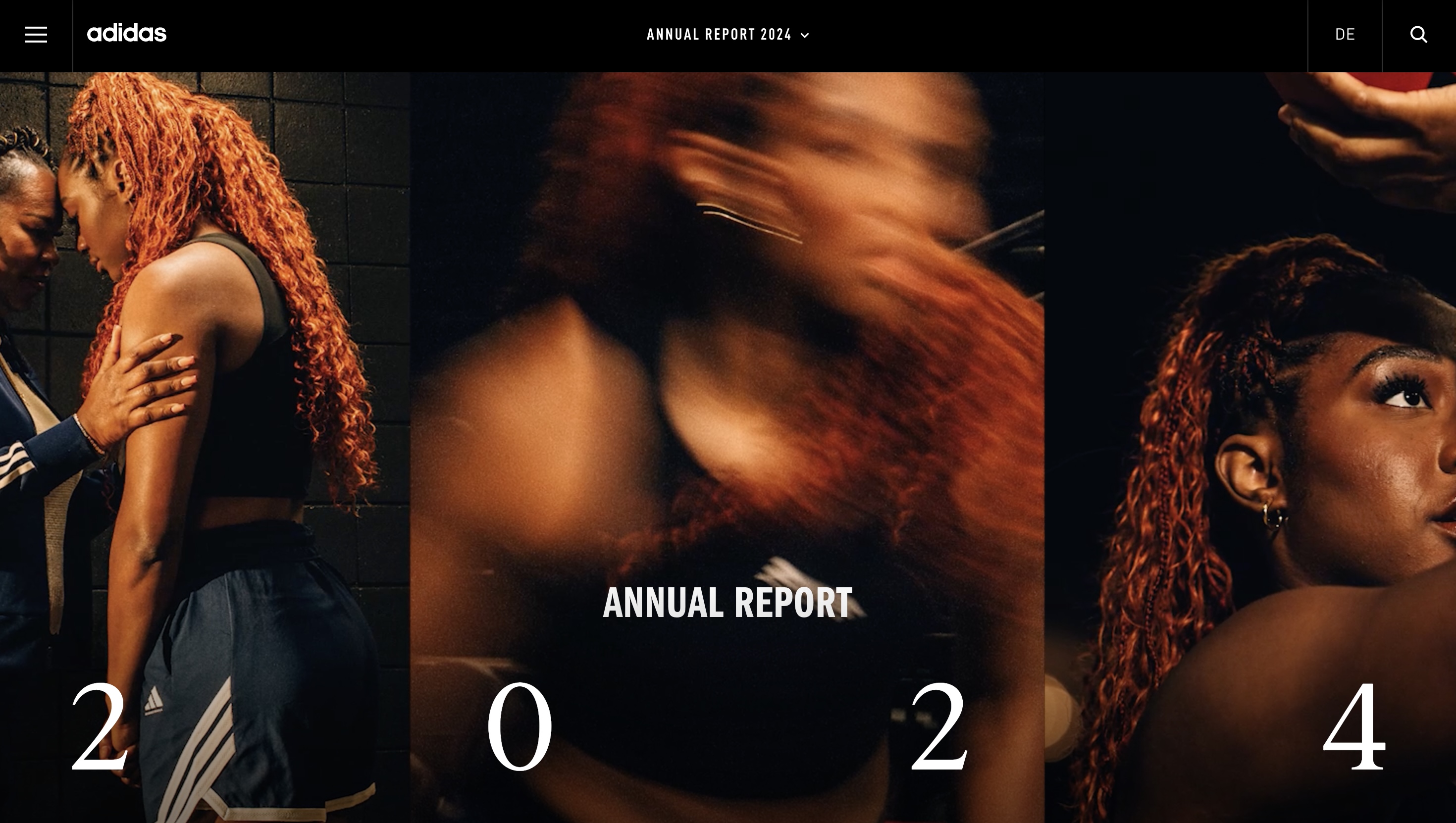
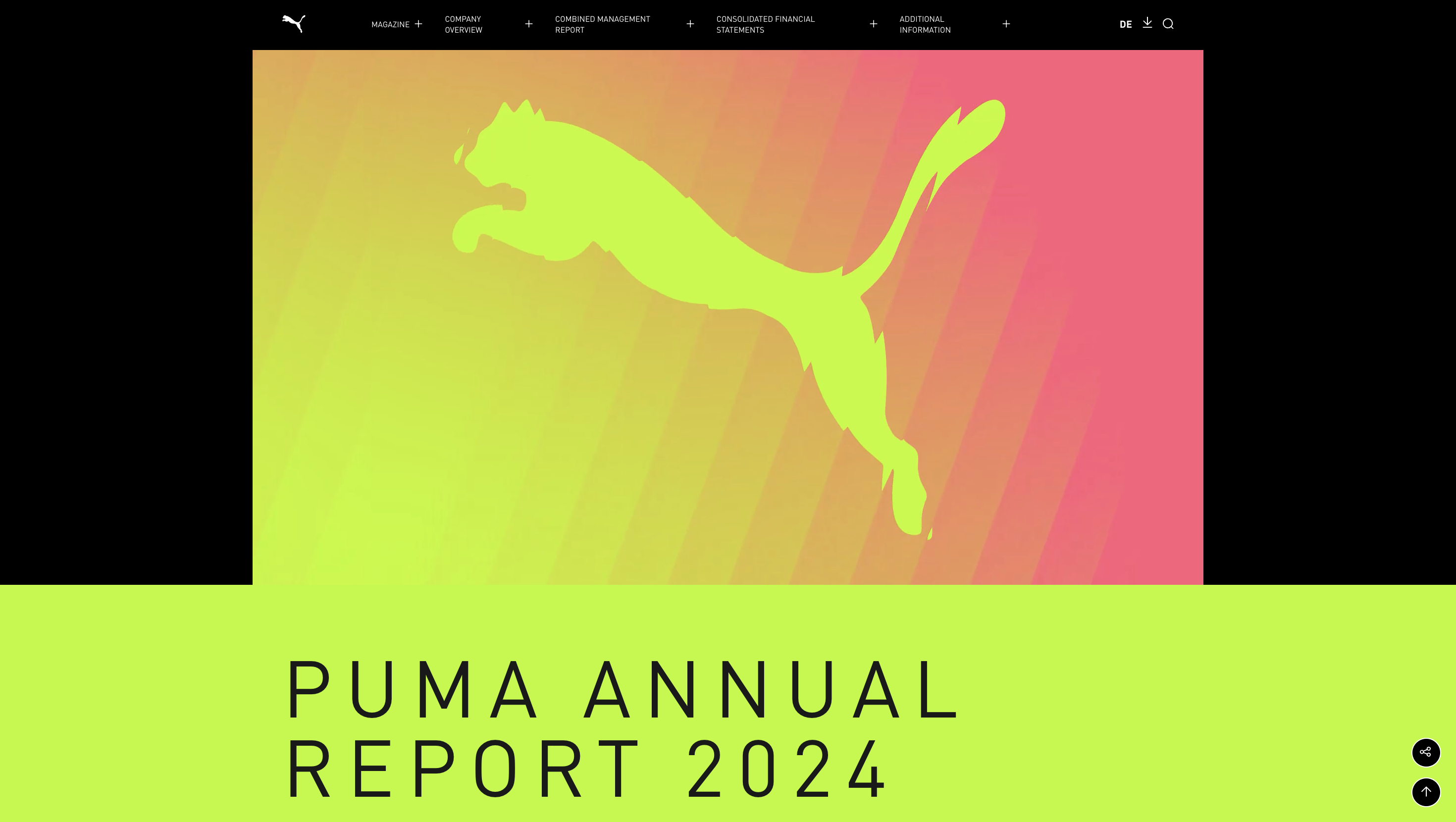
A standout example for structure and navigation is Puma’s annual report, which included five main sections with clear sub-levels and used a progress bar for each section.
2. Design elements
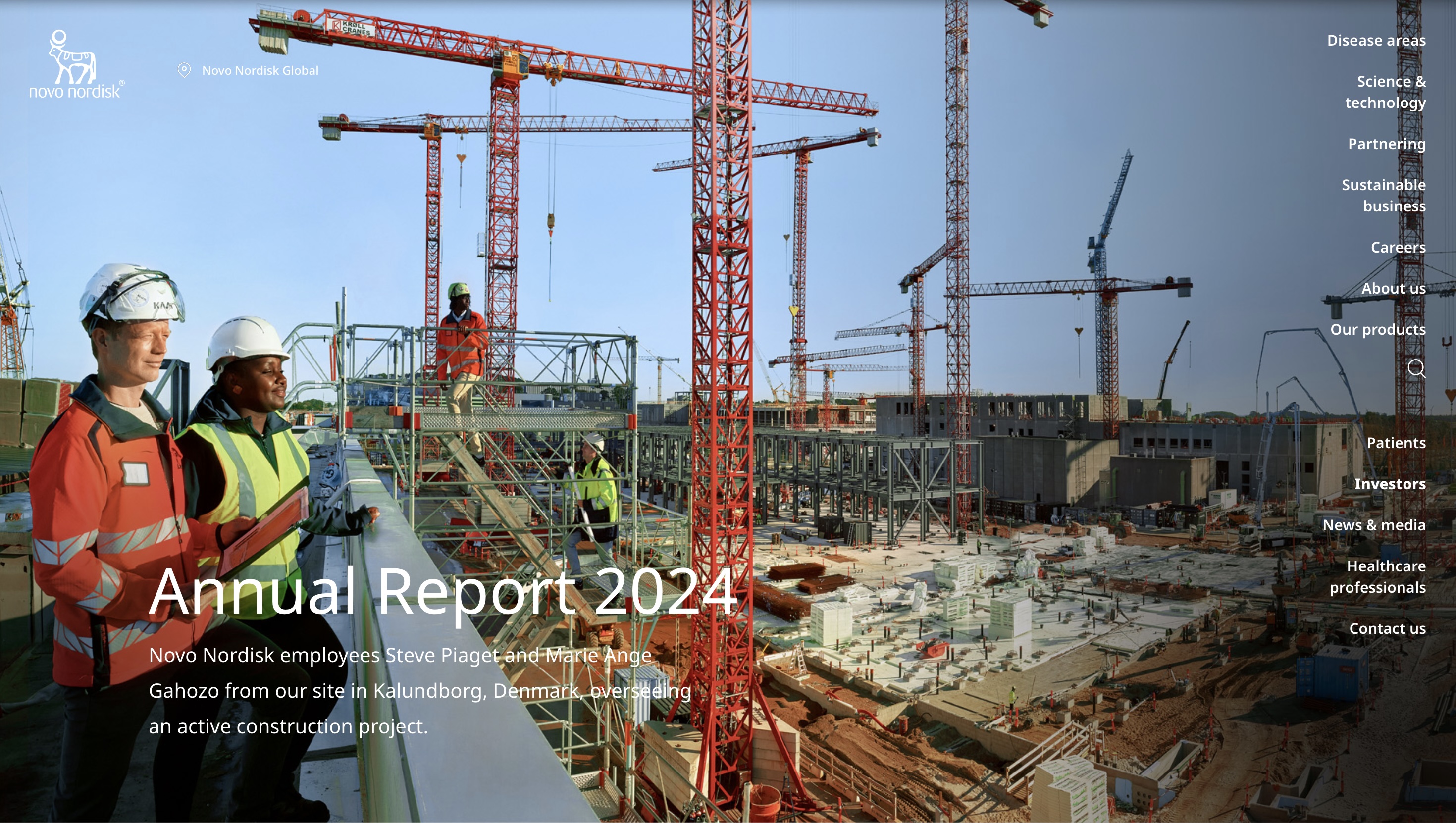
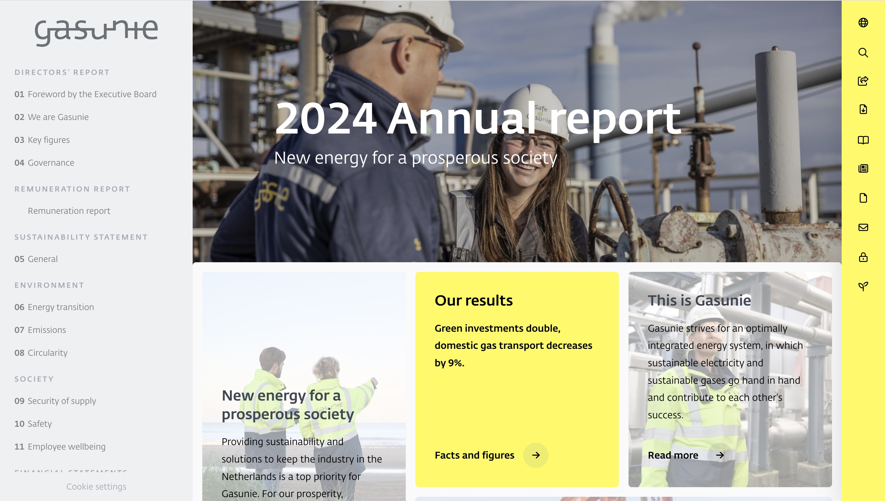
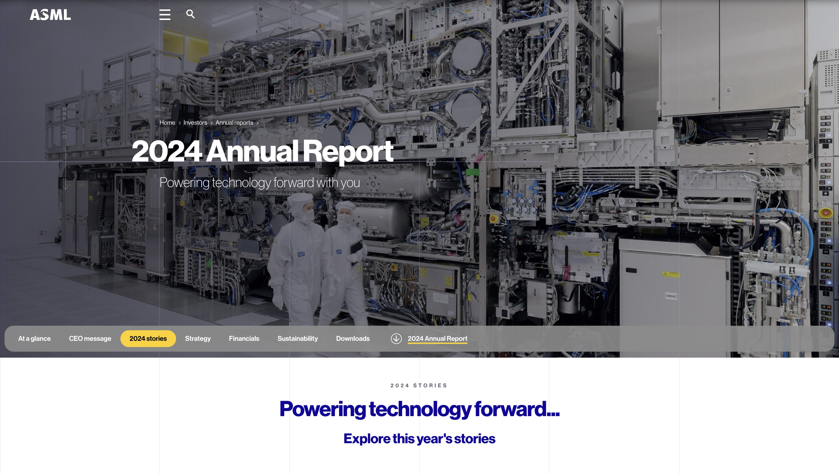
Design is where most reports stood out. While creative design can seem limited for professional industries such as pharmaceuticals, software or energy, reports for these companies, including Novo Nordisk, Gasunie and ASML, stood out for their simple yet visually engaging page layouts, icons and background designs. This elevated the content for clarity and engagement.
Design elements like scroll-triggered animations were effectively used by Adidas, Puma and Novo Nordisk to add visual engagement by animating elements based on the reader’s scrolling position. These also included animations and background video GIFs that added a dynamic layer of multimedia content to the reports.
3. High quality & diverse photography
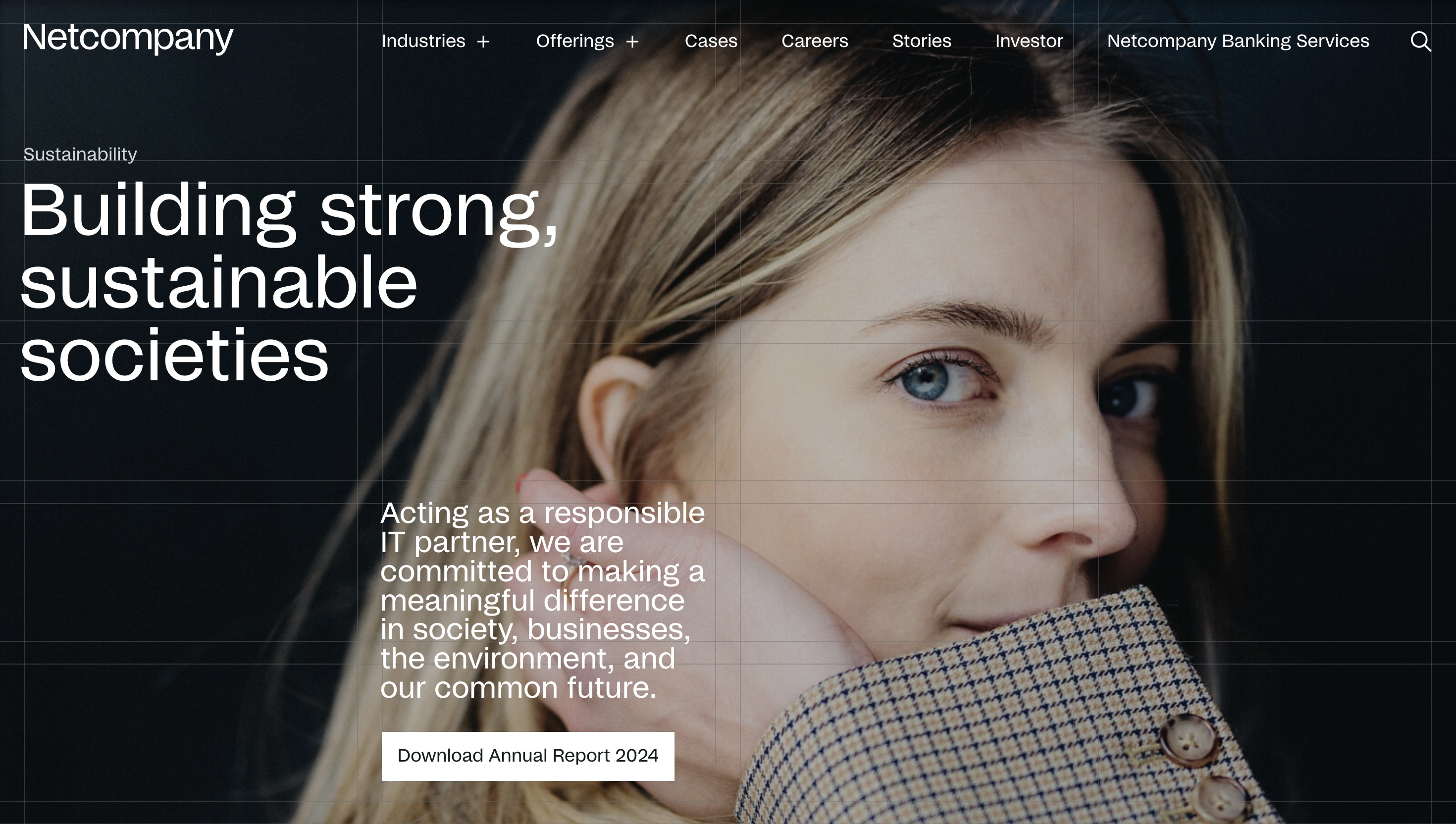
High-quality and diverse photography was another common feature in interactive web reports. 73% of the reports included high-quality images that were authentic and brand-related. Photography also tended to complement the text and was relevant to the contents discussed.
However, the balance between text and photography was disproportionate. In 50% of the reports, long blocks of text outweighed the photography, making the text dominate over the visual elements and disrupting the flow of engagement.
4. Dynamic charts, tables & data
Another prominent feature was the use of data visualisation to simplify complex information. Data visualisation turns numbers and textual information into visual formats that are easier to understand and interpret. It helps readers grasp key messages, spot trends and compare data without looking through tables or paragraphs.
All reports included some form of data visualisations, using elements like count-up animations for statistics, hover-over charts that revealed links with additional information, infographics and comparative data to visually communicate trends.
Gaps and areas for improvement
The move toward interactive reporting marks progress, but there’s still room to improve how interactive elements are used. Across the reports we reviewed, we found consistent gaps where companies can strengthen their approach to interactivity and accessibility.
1. Prominence of case studies
Case studies often lacked prominence and variety. Only 27% of reports included standout case studies. Most were text-based, with four out of 15 reports offering video formats. Given their role in providing real-world context to financial and non-financial data, more visibility and format diversity would improve understanding of company processes through case studies.
2. Interactivity
Although reports included various data visualisations and animation features, interactive elements — such as clickable menus and infographics, hover-over charts and embedded videos — were underutilised across the reports.
For example, videos were used selectively. Six reports incorporated high-quality videos through CEO introductions or case studies, while the remaining five included no videos. Some videos, while informative, had lower production quality or used presentation-style slides, which were less engaging. Use of high-quality videos could strengthen storytelling and make interactive reports more engaging and informative.
3. Accessibility
Website accessibility is an important component of interactive web reports, providing the right to information for all audiences, especially those with disabilities. While most reports performed well across devices, alternative text for photography and illustrations was missing in 14 of the 15 reports.
Other accessibility features such as colour contrast and keyboard navigation, were also inconsistently applied, limiting usability. Without these features, reports risk being difficult to use for some readers, reducing engagement and the overall effectiveness of the interactive experience.
The future of reporting
Producing an annual or sustainability report requires effort in data collection, coordination and preparation. Too often, these investments are used to create dense compliance documents that few stakeholders engage with. Companies can turn this effort into something far more valuable by re-purposing content and shifting towards interactive formats.
Looking ahead, the next generation of corporate reporting will be defined not only by the accuracy of data, but by its accessibility, clarity and ability to connect with stakeholders. Reports that succeed will move beyond compliance to become brand narratives that help audiences understand strategy, see progress and engage directly in the company’s journey.
Get comfortable, there’s more
If you enjoyed this article, there's plenty more media to get your mind into.


What telecom companies flag as material under the ESRS
As connectivity demands rise globally, it is crucial to understand the sector’s emerging sustainability challenges. A review of leading companies’ material topics shows a strong focus on digital inclusion and climate impacts, along with growing attention to affected communities and circularity


Sign up to our newsletter
and we'll report back to you with industry news and updates you'll actually want to know.